According to Usability.gov, Usability Testing is a research technique used to evaluate a product or service. The tests have been performed with participants that are a representation of the target audience. Each participant tries to perform the tasks while an observer watches, listens and writes down notes about the test.
It is important to note that the focus of the Usability testing is to observe what people do instead of what they say.
The relevant sections of the checklist suggested by Loranger (2016) were followed for the Usability testing.
The goal of this research was to test the prototype and find usability problems in the screens that were not detected during the self-evaluations and the guerilla testing. Additionally, the aim was to gather behavioural data about how the participants felt about the proposed method of logging food via a chatbot.
The tests were performed in different locations. According to Nielsen (2012), it almost doesn’t matter where you conduct user testing. Therefore a travelling usability lab was set up.
The studies were moderated so the observations could provide richer design insights and opportunities to probe and ask for clarification. Finally, the tests were done with the participants and the observers in the same room to facilitate the detection of subtle cues.
Nielsen (1993) affirmed that with “5 users, you almost get close to user testing’s maximum benefit-cost ratio”. Therefore the tests were performed with five users in the first iteration and six users for the second iteration.
Participants were picked by identifying people that were within the results of the initial demographics research and people that matched the User Persona built previously.
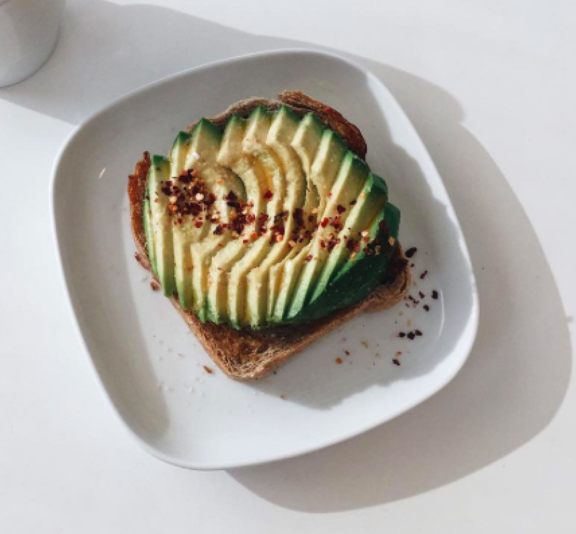
Users were given specific tasks with a unique endpoint. The task was to log what they had for breakfast in 3 different ways: by text, by photo and by voice. The breakfast was set previously as 250 grams of avocado and 250 grams of toast (Fig. 2) to enable a timing comparison between different entry methods.
A test pilot was run, and a few inconsistencies were found in the information sheet given to the participants.
After the tasks were performed, users were given a SUS questionnaire to subjectively measure the perceived usability of a product, followed by a short semi-structured interview before discharging the participants.
A test plan was put together (Annex 11) to work as guidelines for the observers.

First test
The screens were generated using Sketch and uploaded to InVision to display the prototypes in the devices used by the participants. The sessions were recorded in different ways, some tests were recorded with QuickTime Player, and other tests were recorded with a camera phone pointing at the participant’s hands and screen.
Video 1. Usability test performed with the user using the first prototype.
A total of six participants were included in this test, but one participant could not complete the tasks because of the issues with the prototype. Consequently, the data regarding this particular participant was discarded.
After the tests were performed, a list of issues was compiled in a table (Fig. 4), and a proposed solution offered to each problem detected.
The videos and notes can be visualised in Annex 12 and Annex 13, respectively.
| Issue | Solution |
|---|---|
| Task unclear setting | Maybe tell users they are going to experience a bot integration. But not sure this is best solution. |
| Confused ‘Why is the app asking about breakfast?’ | Change scenario state you're inputting info for breakfast, the time and situation. |
| Prototype reactions especially on the voice interaction | Insure another person conducts the user test with you. One to record task and one to act as the bot ‘Rockie’ and to the automatic reactions. |
| Users didn’t know what the plus meant | Make plus blue so it’s more clear and may add text ‘add’ |
| People didn’t know they were talking to a bot | Make it clear they are talking to Rockie. Let ‘Hey! What’s for breakfast?’ take over the whole screen |
| Didn’t like the app was text and talking to them | Make it clear they can input information through the diary |
| Felt the interaction was too personal texting someone | Give them the option no to talk to the coach “Rockie” |
| Prototype reactions on text | Participants felt that the prototype was jumping and auto-populating the information |
| Prototype reactions especially on the voice interaction | Participant felt that the voice feature was inconsistent with real-life systems and therefore couldn’t complete the task. |
| Reactions on photo input | The simplest task to complete, however as an observer the participant accidentally clicked on "DONE". |
| Participants clicked on gets suggestions | Highlight button as the primary call to action within the screen |
| As the facilitator of the test it was difficult to guide the participant when it the prototype could not perform the task as expected. | Highlight within the usability study that the app tested today is a prototype and that there may be minor things they may find do not work as expected, however they should be highlighted. |
Figure 4. Compilation of errors detected in the first user test.
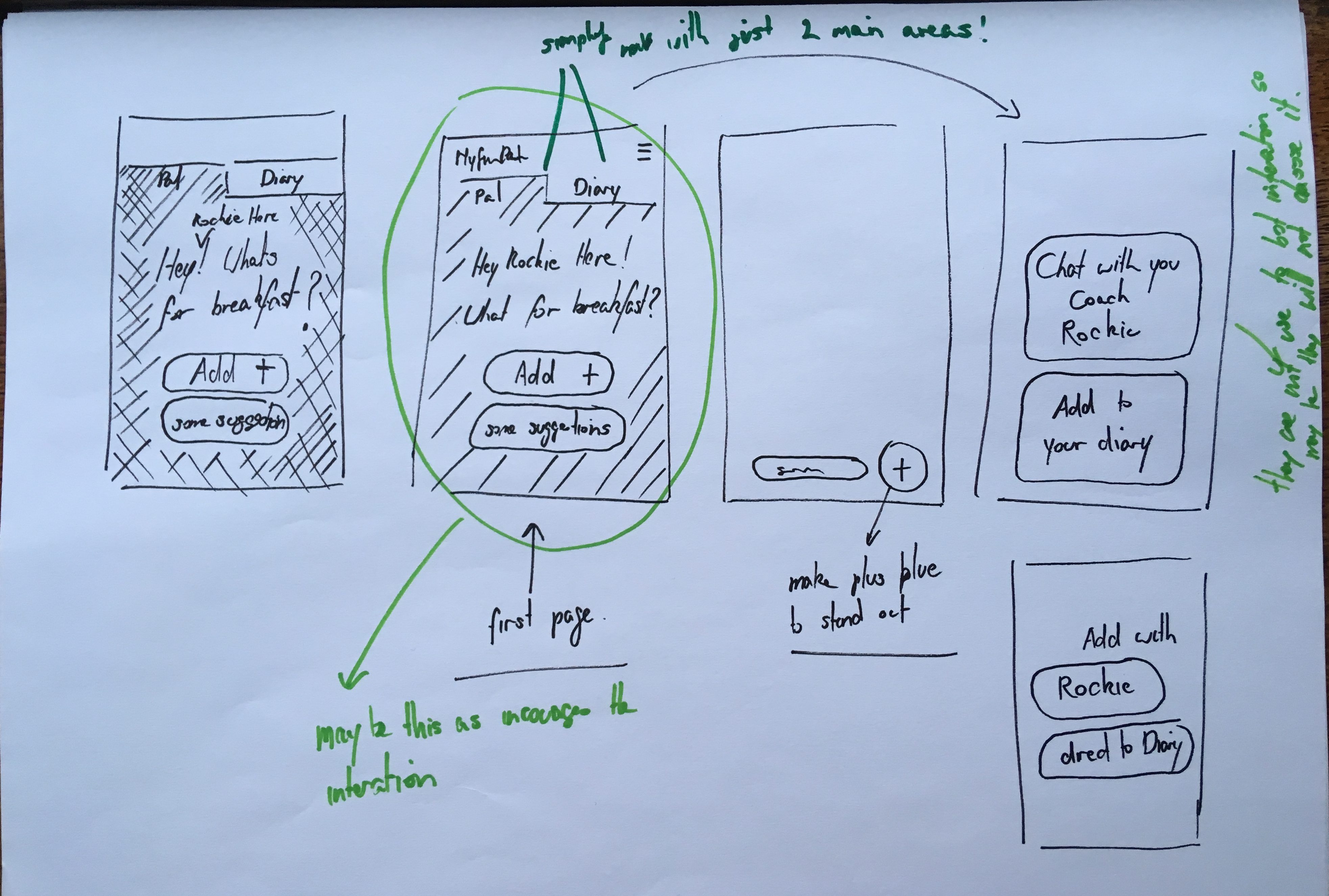
A new series of sketches based on the proposed solutions were made (Fig. 5).
Second prototype
Based on the feedback from the first iteration a new set of screens were generated using Sketch and recorded (Video 2, Video 3 and Video 4).
Figure 6. Initial screen added to introduce the bot interaction.
Voice entry
Video 2. Voice entry example.
Text entry
Video 3. Text input example.
Photo entry
Video 4. Photo entry example.
User testing
The second prototype was tested with six users. A modified version of the information sheet (Annex 14) was given to the participants as some of the issues occurred because the high fidelity prototypes enticed the participants to believe that they were using a production version of MyFitnessPal.
Video 5. User test using InVision to display prototypes and Lookback to capture screen and image of the participants.
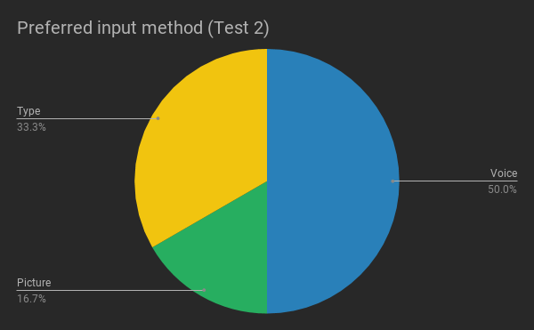
Even though there were issues during the tests, all users responded that they would prefer the proposed solution than the current MyFitnessPal. All videos and notes are available in Annex 12 and Annex 13, respectively.
A new table with problems detected and possible solutions for each item was compiled (Fig. 7).
| Issue | Solution |
|---|---|
| By text: user wanted to click on the educational tool and it to react. ie it to appear as text. | Enable users to put in one piece of information at at time. |
| By text: People said they wouldn’t use ‘and’ but just input one piece of information at a time | Same as above |
| By photo: didn’t know you needed to click twice when confirming information. | Use an overlay to explain reaction. (was in original prototypes) |
| User felt they wouldn’t use voice | This input would need to be tested with the observer being in a different room as the user didn’t seem comfortable talking to the app in the front of another person. |
| Rockie’s character didn’t come across! | I think our only solution would be to test over a longer period of time |
| User laughed at the idea of entering the information by voice in front of someone else. | Voice test needs to be done remotely to have a good result |
| User had troubles with the microphone icon | Add the MICROPHONE icon beside the ADD NEW in the first screen so user don't have to make 2 clicks to find MIC icon. |
| User questioned if the voice feature would work with her accent. | Technology needs to be ready and well tested. |
| User hesitates when adding by photo. | Screen to add avocado and toast by photo needs to be clearer |
| Adding by photo, confirmation button is too far to reach | Move confirmation to the right side of the screen |
| Don't like the use of voice in front of other people | Voice test needs to be done remotely to have a good result |
| Participant expected to send in list format (Avocado > select weight > send, Toast > select weight > send) | Allow user to input in list format, this would also be similar to the current input where items are input individually |
| Participant laughed and wasn’t sure why letter were appearing assumed it was autocomplete. | Only make the letters related to the task tappable |
| Participant commented on allowing users to input the weight or amount manually | Provide an option in the screen below to add weight manually ( i think we previously discussed this, however, didn’t add to wireframe)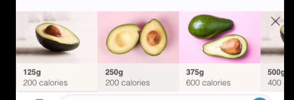 |
| Participant recognised that the data was inconsistent between the task and the prototype | Include consistent data throughout the task/prototype |
| Participant commented that the weight of the bread isn't realistic ‘250g is a lot of bread’ would be better highlighted in slices ‘do people weigh bread?’ | Update g’s to slices |
| Participant expected feedback/indicator of his recording on the screen before sending it. He might have been tapping the screen to see if anything happened as he had previously seen in the text task | Breakdown and update the steps in the voice task, in particular, the screen below offers no indicator that a voice recording has been sent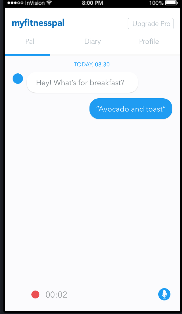 |
Figure 7. Compilation of errors that occurred in the second user test.
Results
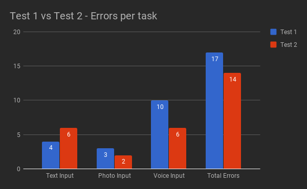
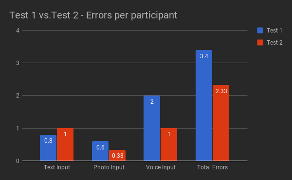
Most of the errors in both versions (Fig. 8 and Fig 9) were caused by issues with the fixed mental model set on the prototypes. In Test 2, this was the case for 11 out of 14 errors.
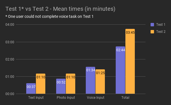
The times to perform the tasks (Fig. 11) increase in Task 2, the reason is that the second prototype a more realistic approach, the user had to type “avocado and toast”, and perform a full voice interaction with Rockie.
| SUS Scores | |
|---|---|
| User 1 | 62.5 |
| User 2 | 55 |
| User 3 | 60 |
| User 4 | 95 |
| User 5 | 62.5 |
| Average | 67 |
| Median | 62.5 |
Figure 13. SUS Scores of Test 1.
| SUS Scores | |
|---|---|
| User 1 | 90 |
| User 2 | 90 |
| User 3 | 90 |
| User 4 | 92.5 |
| User 5 | 92.5 |
| User 6 | 63 |
| Average | 86.25 |
| Median | 90 |
Figure 14. SUS Scores of Test 2.
| Test 1 | Text Input Time | Photo Input Time | Voice Input Time | Total Time |
|---|---|---|---|---|
| User 1 | 00:45:00 | 00:22:00 | 02:05:00 | 03:12:00 |
| User 2 | 00:54:00 | 00:53:00 | 01:15:00 | 03:02:00 |
| User 3 | 00:40:00 | 02:00:00 | 01:00:00 | 03:40:00 |
| User 4 | 00:13:00 | 00:53:00 | 01:56:00 | 03:02:00 |
| User 5 | 00:33:00 | 00:13:00 | * did not complete | 00:46:00 |
| Average Time | 00:37:00 | 00:52:12 | 01:34:00 | 02:44:24 |
Figure 15. The timing of Test 1.
| Test 2 | Text Input Time | Photo Input Time | Voice Input Time | Total Time |
|---|---|---|---|---|
| User 1 | 02:11:00 | 00:27:00 | 01:08:00 | 03:46:00 |
| User 2 | 00:26:00 | 00:39:00 | 01:25:00 | 02:30:00 |
| User 3 | 00:54:00 | 02:14:00 | 01:06:00 | 04:14:00 |
| User 4 | 00:53:00 | 01:22:00 | 01:57:00 | 04:12:00 |
| User 5 | 01:01:00 | 00:53:00 | 01:45:00 | 03:39:00 |
| User 6 | 01:35:00 | 01:26:00 | 01:10:00 | 04:11:00 |
| Average Time | 01:10:00 | 01:10:10 | 01:25:10 | 03:45:20 |
Figure 16. The timing of Test 2.
Conclusion
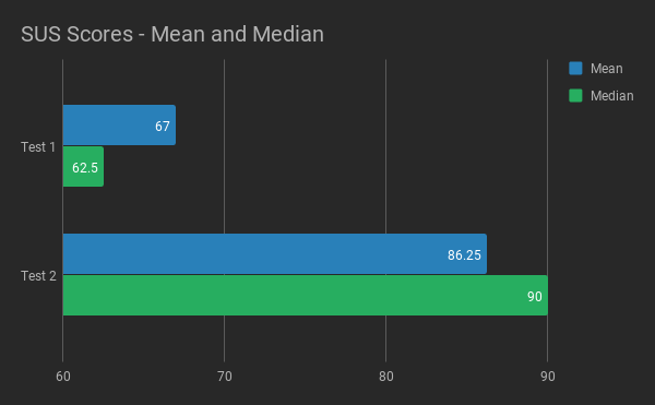
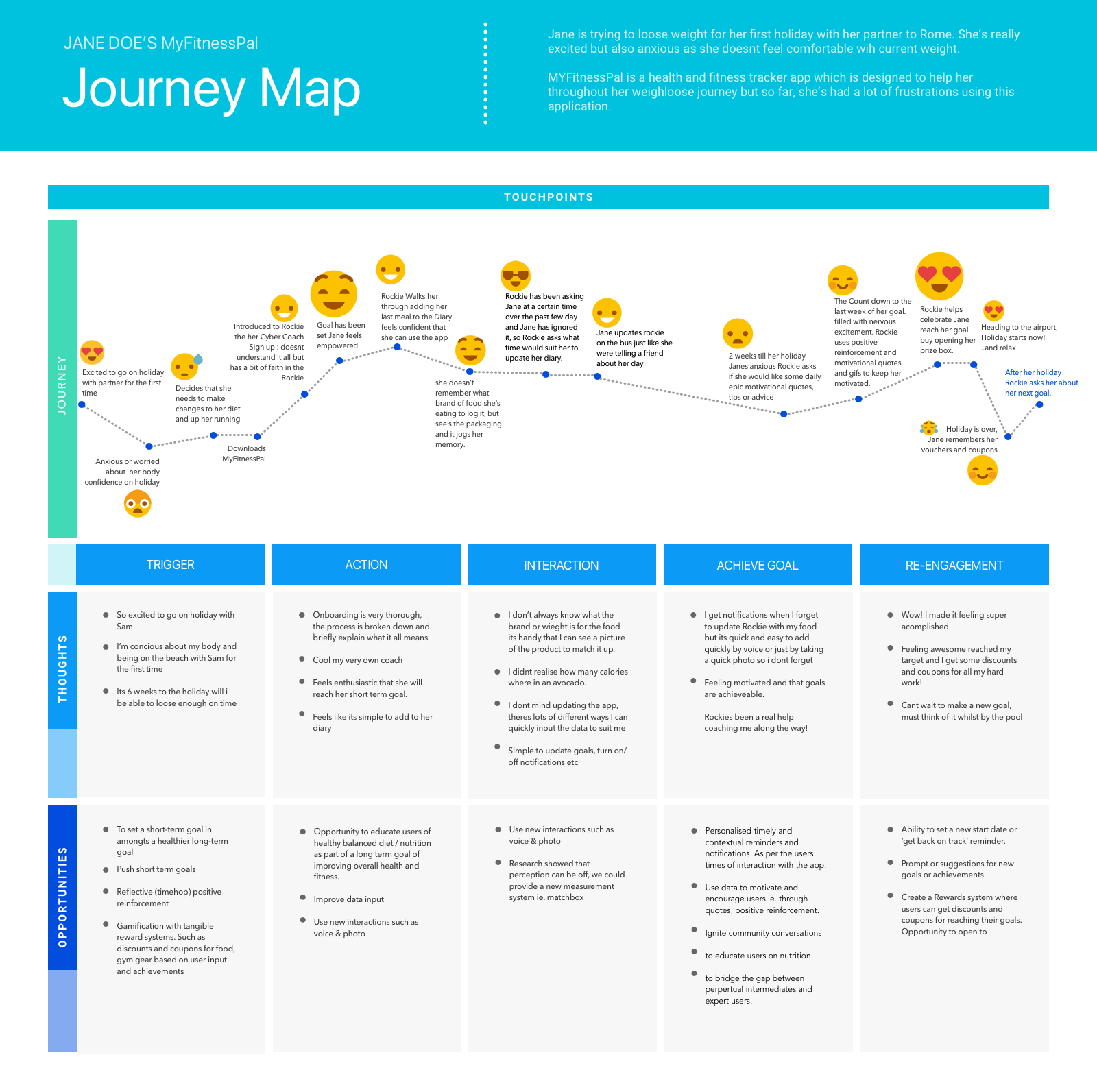
According to Sauro (2011), a SUS score above 68 would be considered above average, and anything below 68 is below average (Fig. 17). A score above 80.3 is equivalent to an A. The mean SUS score of the first test was 67, and the median SUS score was 62.5. The second test received a mean SUS score of 86.25 and a median SUS score of 90. This excellent progress resulted in a new and improved user journey (Fig. 18).


References
Usability Testing (n/a). Retrieved from https://www.usability.gov/how-to-and-tools/methods/usability-testing.html
Loranger, L. (2016). Checklist for Planning Usability Studies. [https://www.nngroup.com/articles/usability-test-checklist/]. Accessed 15 April 2018.
Nielsen, J. (2012). Travelling Usability Lab. [https://www.nngroup.com/articles/traveling-usability-lab/]. Accessed 15 April 2018.
Nielsen, J., & Landauer, T. K. (1993). A mathematical model of the finding of usability problems. Proceedings of the SIGCHI Conference on Human Factors in Computing Systems – CHI 93. doi:10.1145/169059.169166
Sauro, J. (2011). Measuring Usability with the System Usability Scale (SUS). [https://measuringu.com/sus/]. Accessed 15 April 2018.
