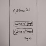
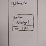
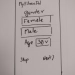
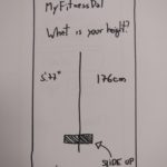
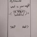
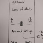
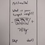
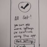
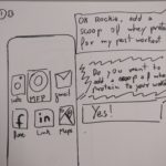
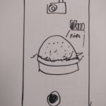
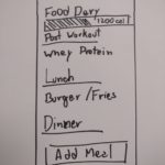
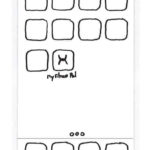
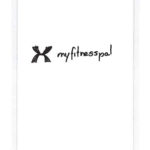
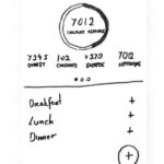
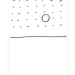
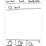
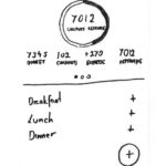
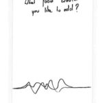
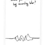
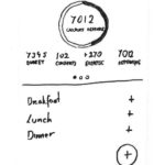
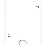
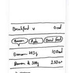
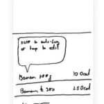
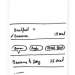
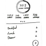
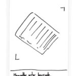
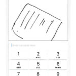
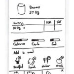
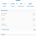
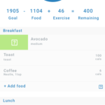
The tasks that emerged were the onboarding process and logging food into the diary. A Crazy Eights was performed (Fig. 1) for each of the tasks to generate design ideas (Levey, 2016). The results were then evaluated, and the suitable solutions were selected for the next stage of prototyping.
Figure 1. Onboarding and food logging processes.
Based on user research, the task of logging food into the diary is the most common task. Improving the experience in this process could potentially solve the issues declared in the problem statement. Consequently, the redesign process would only be made on the logging food task leaving the on-boarding process out of the scope of this project.
An evaluation of the current MyFitnessPal with the task of logging food was also performed (Video 1).
Video 1. Usability test with the production version of MyFitnessPal.
During the initial prototypes, the idea of a bot appeared (Fig. 1 – Food Logging 1) along with the camera being able to display calories (Fig. 1 – Food Logging 2).
The goal of creating a bot is to solve other pain points identified during the research:
- Users feel the app is impersonal.
- Users don’t see improvements.
- Users forget the app has been installed.
After gathering suitable solutions for the chosen task, a more elaborate paper prototype emerged (Fig. 2). The ability to enter food by different methods were added to fit various times of the day from the user perspective: text entry, barcode entry, voice entry and photo entry.
Figure 2. More elaborated paper prototype based on the task of logging food.
Moving to High Fidelity
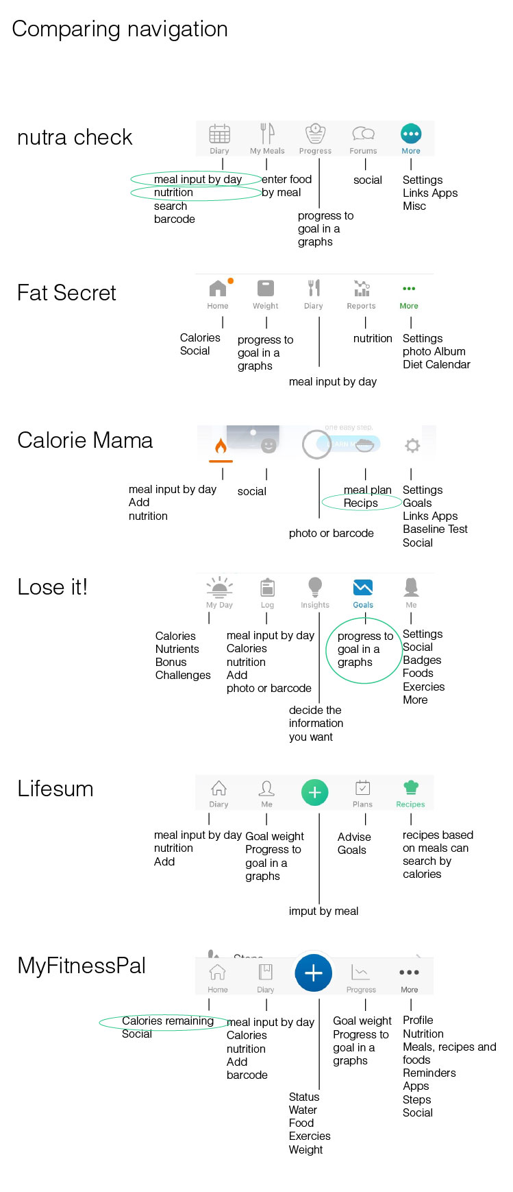
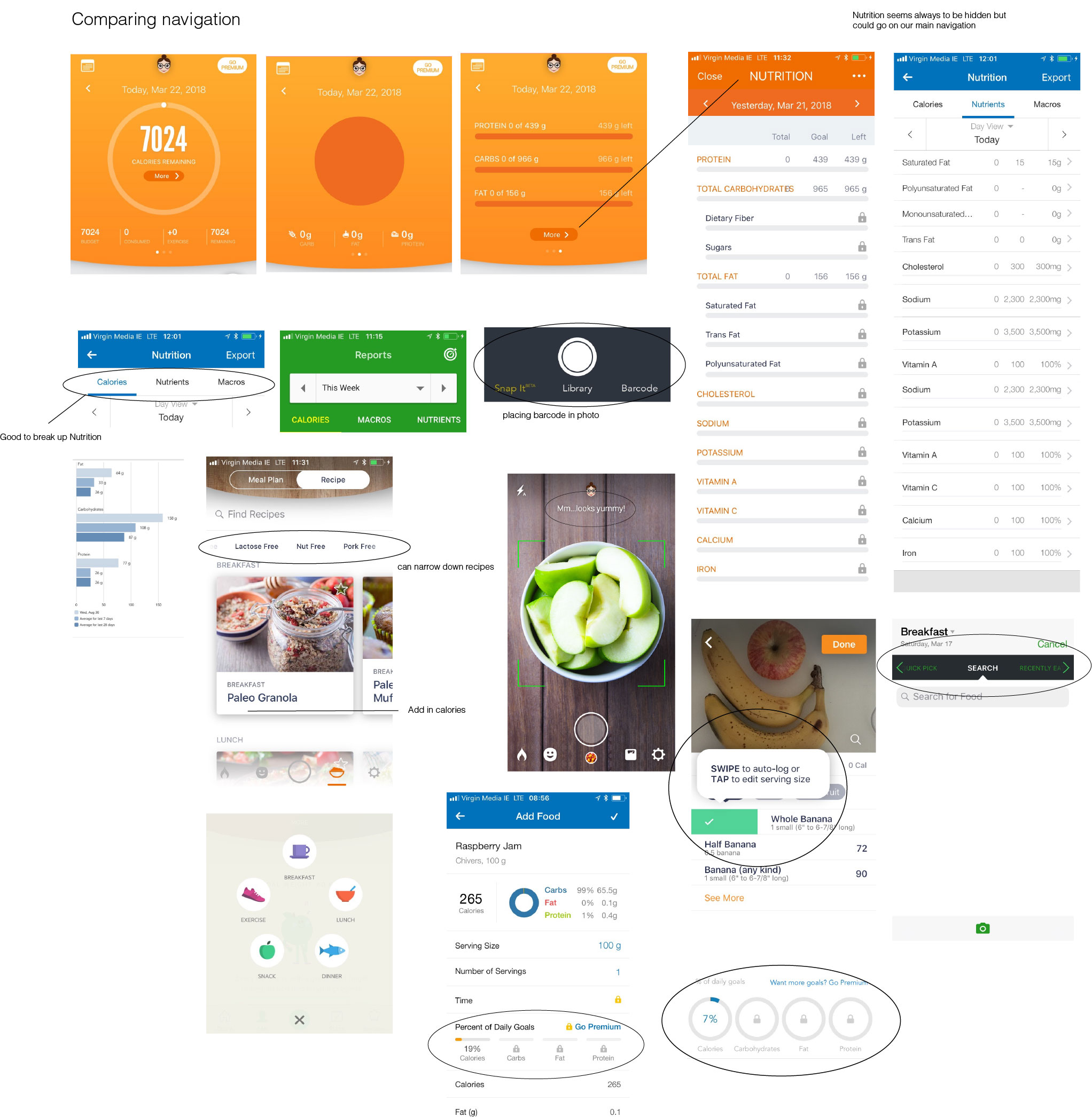
To create the prototypes it was fundamental to take the Persona, Jane, in consideration. The visuals had to incorporate elements known to her. An extensive study of visual aspects of other apps was conducted (Fig. 3 and Fig. 4). Don Norman’s (1988) 6 principles of interaction design also worked as guidelines. Finally, the heuristics evaluation indicated which elements needed to be fixed before producing a version to be tested with the users.
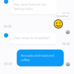
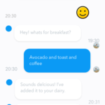
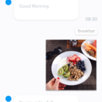
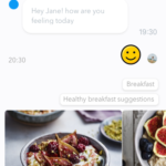
Following the study of visual elements and the critique of the last paper prototype, a more elaborated prototype emerged (Fig. 5). One of the prominent features was the addition of a chatbot named Rockie. Chatbots are platform independent, allowing for a single implementation throughout any device.
Instead of an approach where the user would need to click in different areas to log the food intake, the team proposed a solution where the interaction with Rockie would handle different input methods (photo, text, voice) and give information as requested by the users. The old user interface would still be available at the top, but Rockie would be the landing feature.
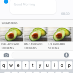
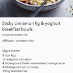
As verified during the Perception Test, the visual guidance improved the user’s ability to guess more precisely the weight and calories of food items. Therefore, a visual guide was added when inputting food elements without a scale (Fig. 5 – Text entry 4).
Figure 5. Emerged prototype after team’s critique of last iteration (Fig. 2).
Finally, another round of self-evaluation was done to arrive at the prototype that was going to be presented to the users (Fig. 6) during the first user tests.
Video 2. The last prototype self-evaluated by the team.
References
Levey, Y. (2016, July 27). How to: Run a Crazy Eights exercise to generate design ideas. [https://www.iamnotmypixels.com/how-to-use-crazy-8s-to-generate-design-ideas/]. Accessed 15 April 2018.
Norman, D. (1988).The Design of Everyday Things. Basic Books, 2013.
