Personas

Personas are fictitious characters with aspects that represent the group of users which the product created will be targeted. According to Cooper (2007), Personas are archetypes constructed in behaviour patterns revealed during user research and are built with the purpose of being a communication tool during the creation of the product.

Personas help better comprehend the objectives of the users in different contexts of use,  align the efforts towards creating a product that would solve issues identified and declared in the problem statement.

In the results of our quantitative (Annex 2) and qualitative research (Annex 6), a few traits of the users became apparent. The Persona was created from patterns observed in the interview data and contextual inquiry based on Cooper (2007) principal steps.

While building the Persona, a few gaps of information surfaced. It was assumed that users were using MyFitnessPal on their mobile phones. If this was incorrect, it could have disastrous results. To fill these gaps, another questionnaire (Annex 8) was sent to gather further details about the users of MyFitnessPal.

A total of 61 participants that use health & fitness apps or websites answered the new questionnaire. The results and further analysis (Annex 9 & Annex 10) showed that MyFitnessPal users:

  • Cohabiting with a partner (38.8%) or single (34%).
  • Have no kids (91.8%)
  • Annual income between €30,001 to €45,000 (25%)
  • Don’t use voice assistants (79.7%)
    • From those who use: Google Assistant (10.2%) and Siri (10.2%) are the most popular options.
  • Use on mobile devices (96.7%)

This extra data gathered helps understand items not covered during the qualitative or the initial quantitative research.

The Persona was created from patterns that surfaced on the interview data and contextual inquiry using Reimann, Goodwin and Halley at Cooper’s (2007)  principle steps:

  1. Identify behavioural variables.
  2. Map interview subjects to behavioural variables.
  3. Identify significant behaviour patterns.
  4. Synthesize characteristics and relevant goals.
  5. Check for redundancy and completeness.
  6. Expand description of attributes and behaviours.
  7. Designate persona types.

The behavioural variables determined were: Weight Management, Activity Level, Goals, Aptitude / Health Knowledge (Fig. 1) and iterations were performed (Fig. 5) to match the user research.
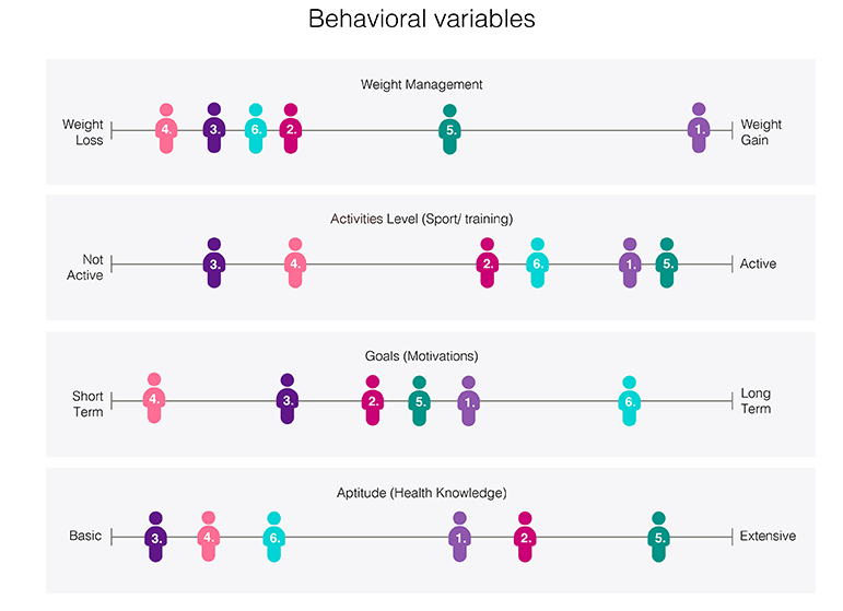
Figure 1. Behavioural variables

One group was very distinctive user 3 and 4 with four occurrences (Fig. 2).
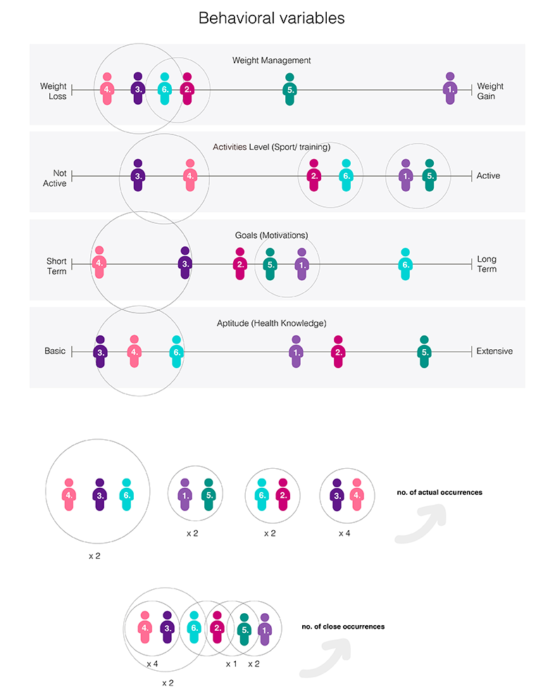
Fig 2. Emerging patterns of behaviour variables.

User 6 and 2 displayed a pattern and user 1 and 5 another, but these groups also showed a close relationship with user 3 and 4. The critical needs/pain points of each group identified were mapped (Fig. 3). The development of one persona based on the group defined as user 3 and 4 would focus research.
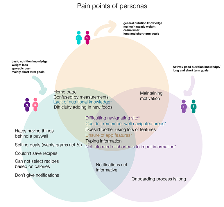
Figure 3. Pain-points identified.

The data from our questionnaire was used to build up a persona called ‘Jane’. She is not a plain Jane but filled with life to build her the best experience (Fig. 4).
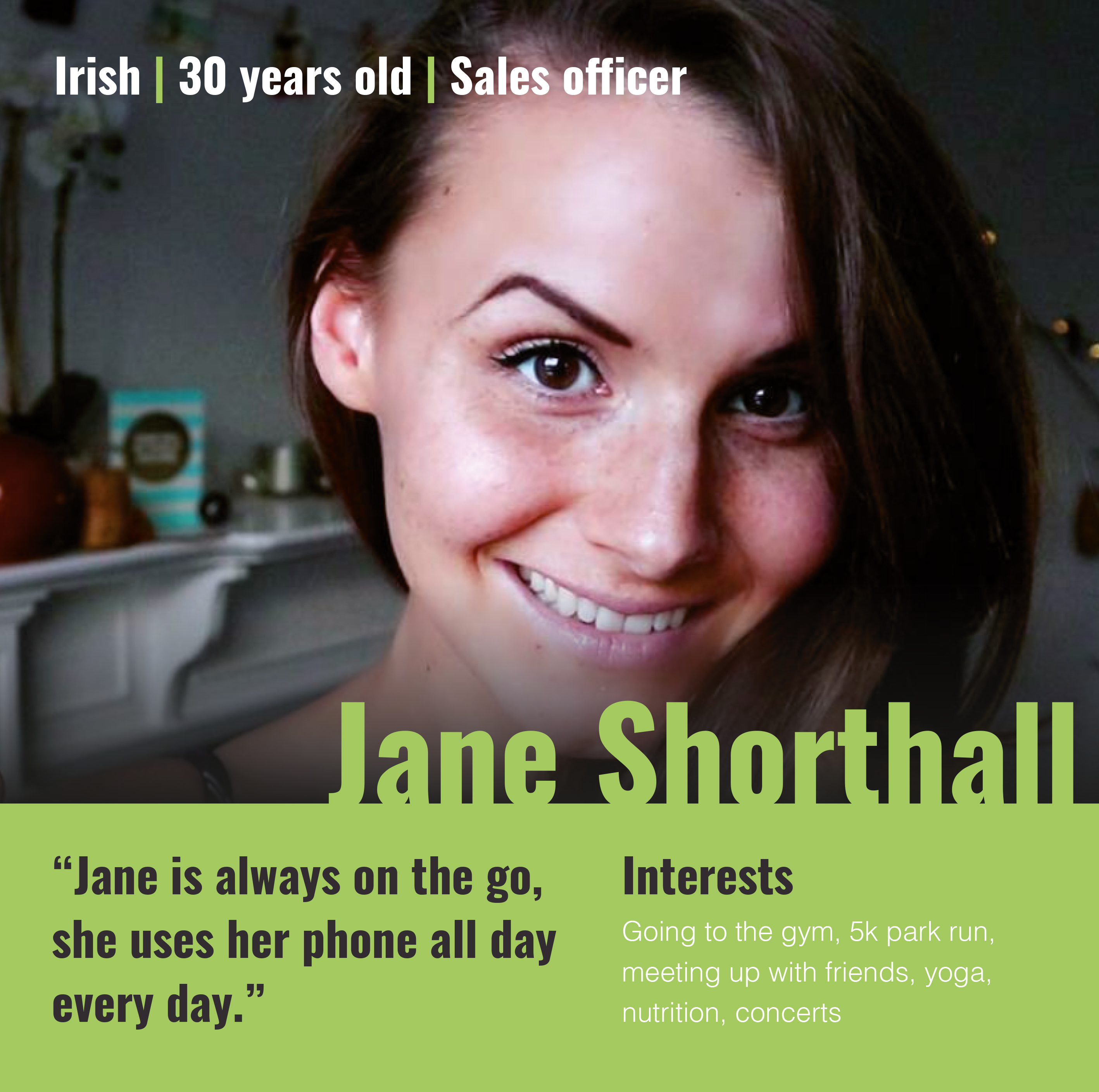
Figure 4. The Persona.

Her goals were rooted in the data collected:

Experience Goals: Easy and quick way of inputting data to a health and fitness app.

End Goals: Ability to easily identify calories, nutrition value of food so she can reach her target weight.

Life Goals: To live a healthy and balanced lifestyle.
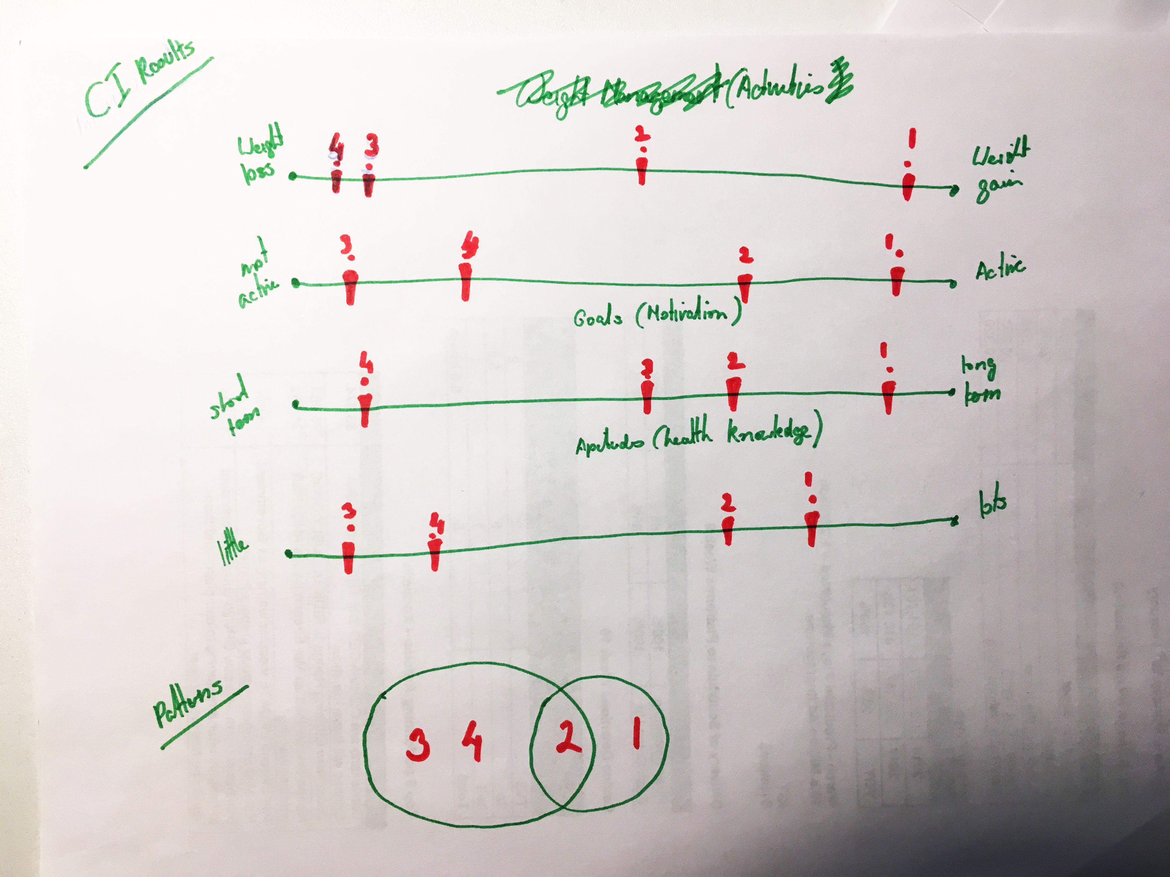
Figure 5. Iterations over the Persona behavioural mapping.
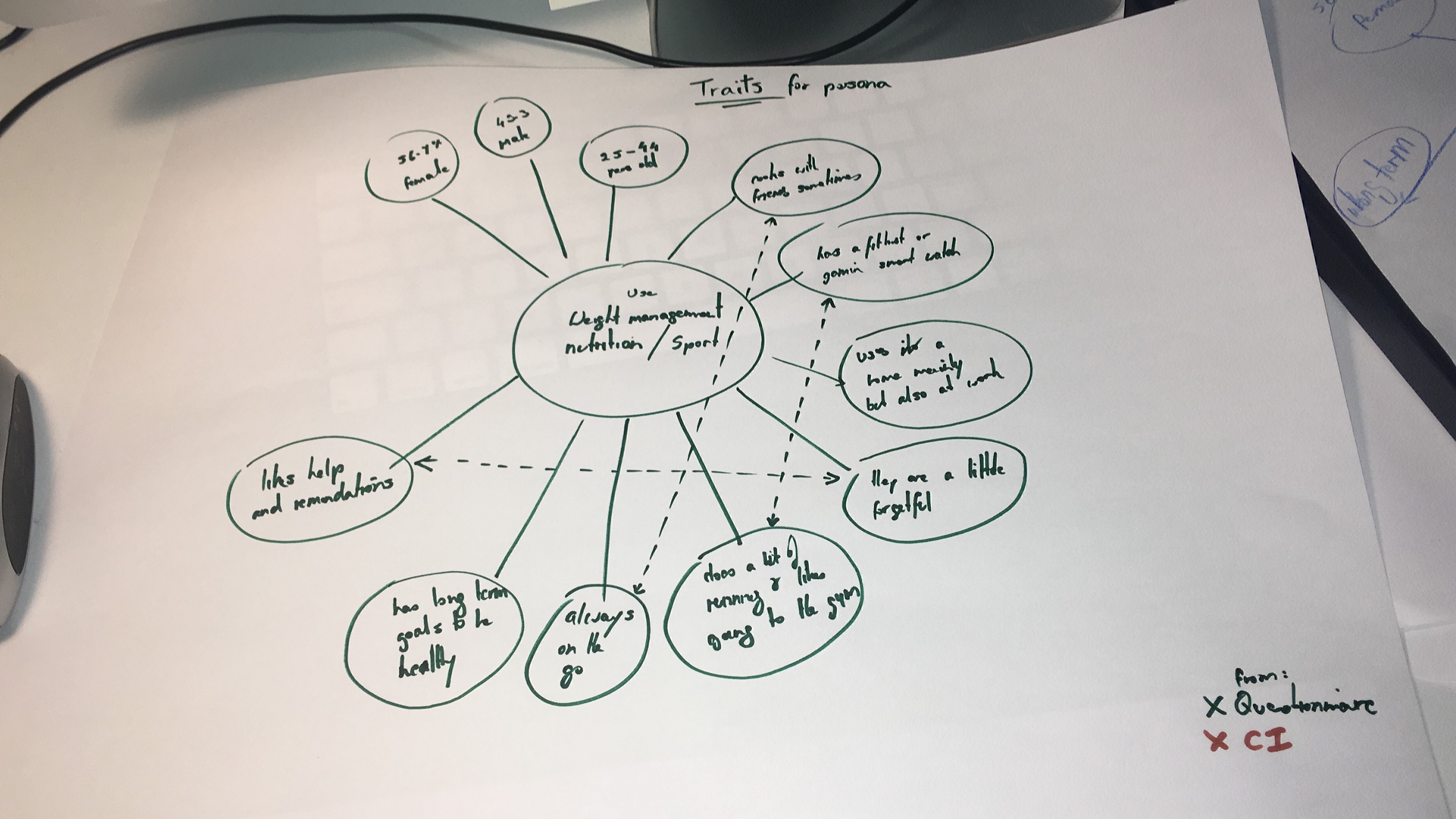
Figure 6. The Persona’s traits.

After the compilation of all the information from the user research, please meet ‘Jane’.
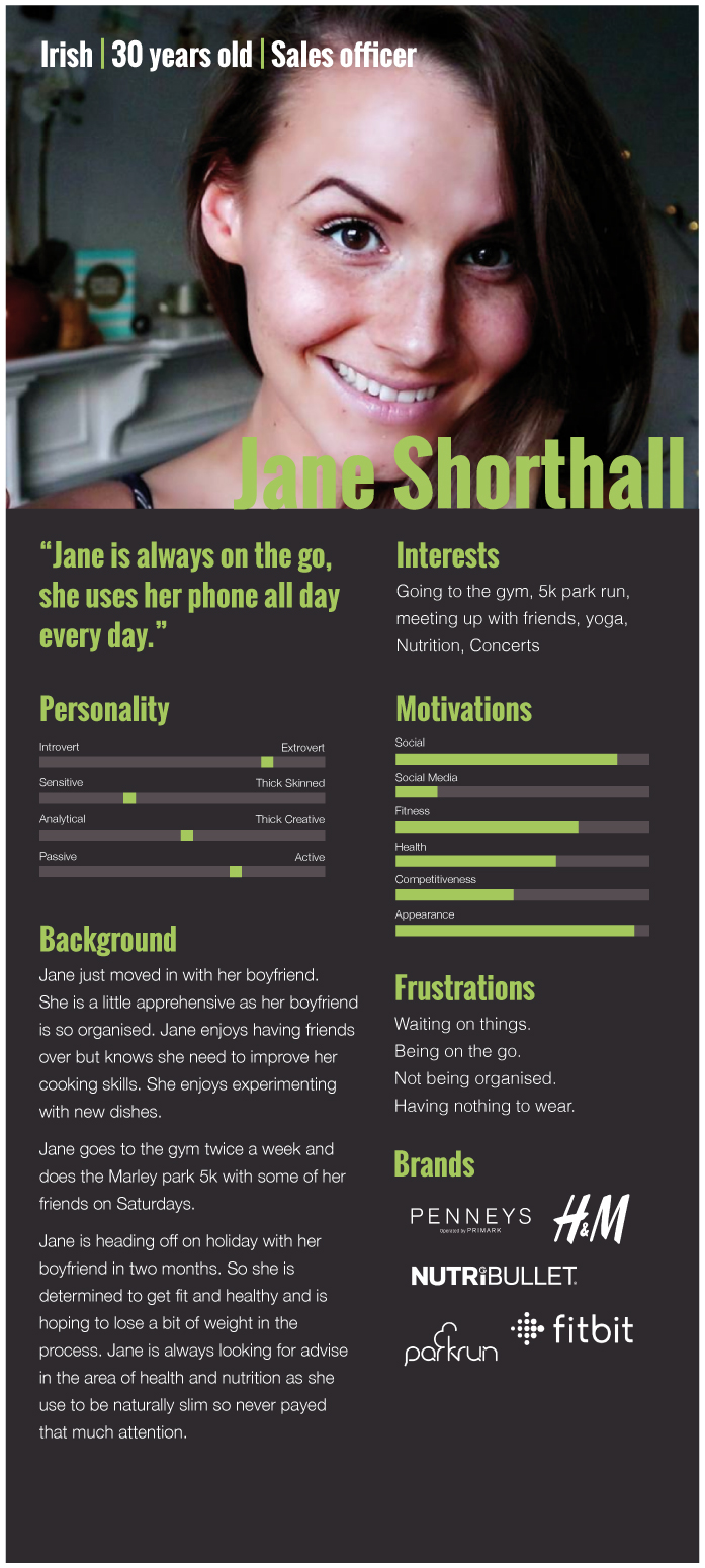
Figure 7. Persona completed.

References

Cooper, A., Cronin, D. and Reimann, R. (2007). About face 3. Indianapolis, [Indiana]: Wiley.
Tasks, Scenarios & User Journeys

Task Analysis

The contextual inquiry revealed that logging food into their diaries was the task that all participants exhibited as their most common interaction with MyFitnessPal. Besides it being the most common task it is also where participants tend to lose motivation to keep using MyFitnessPal.

A second task derived from our problem statement, where a cumbersome interface was not improving the user’s learnability over time. The task was to produce an onboarding process that would educate users about functionalities within MyFitnessPal.

Scenarios

Scenarios help to communicate the essence of the idea of the product or service within a defined context of use. User’s actions are unpredictable but mapping some scenarios can be useful to comprehend the limitations of the solution. The product has to adapt to the contextual use, not the opposite.

According to Cooper (2007), “Goal-Directed scenarios are an iterative means of defining the behaviour of a product from the standpoint of specific users (personas)”. The optimal experience needs to consider external factors that might influence the experience. The scenarios affect the way of thinking about the user’s interaction and the solution itself directly.

The current scenario of use was created based on the feedback of MyFitnessPal users. The information bolded below are pain-points that surfaced during the user research. Jane is the character of the scenario described.

Current Scenario

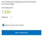
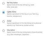
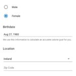
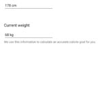
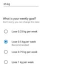
Jane opens the app to set up her account. Taps sign up. She sets up her account, but she’s not sure what her goal isMyFitnessPal recommends that she cut down to 1350 calories a day for a goal of the 1st of April, she feels it a little too much for her. She googles to find out what the recommended calorie intake of a woman should be 2000 calories.

Once setup is complete, Jane adds a cup of tea to the list. She’s unsure if milk is included in the tea. So she types in semi-skimmed milk and adds some to her diary.

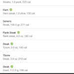
Jane wants to add what she had for breakfast: avocado and toast. When she types avocado, a long list of items shows up. Jane is unsure of what to add and selects the first option.

A few weeks later, Jane has been using the app and feels there isn’t much progress. She doesn’t know much more about nutrition than from when she started. She’s been trying to log her food but it’s a lot of effort to log throughout the day, it can be difficult to remember. She has figured out that some of the items shown in the search results aren’t the right ones and have way more calories when compared to the actual packaging or scanning in. She’s been sticking to simple food and is starting to get bored and would love to be able to make spaghetti bolognese but doesn’t know how to work out all the information (she doesn’t know that this feature is available).

Journey Map

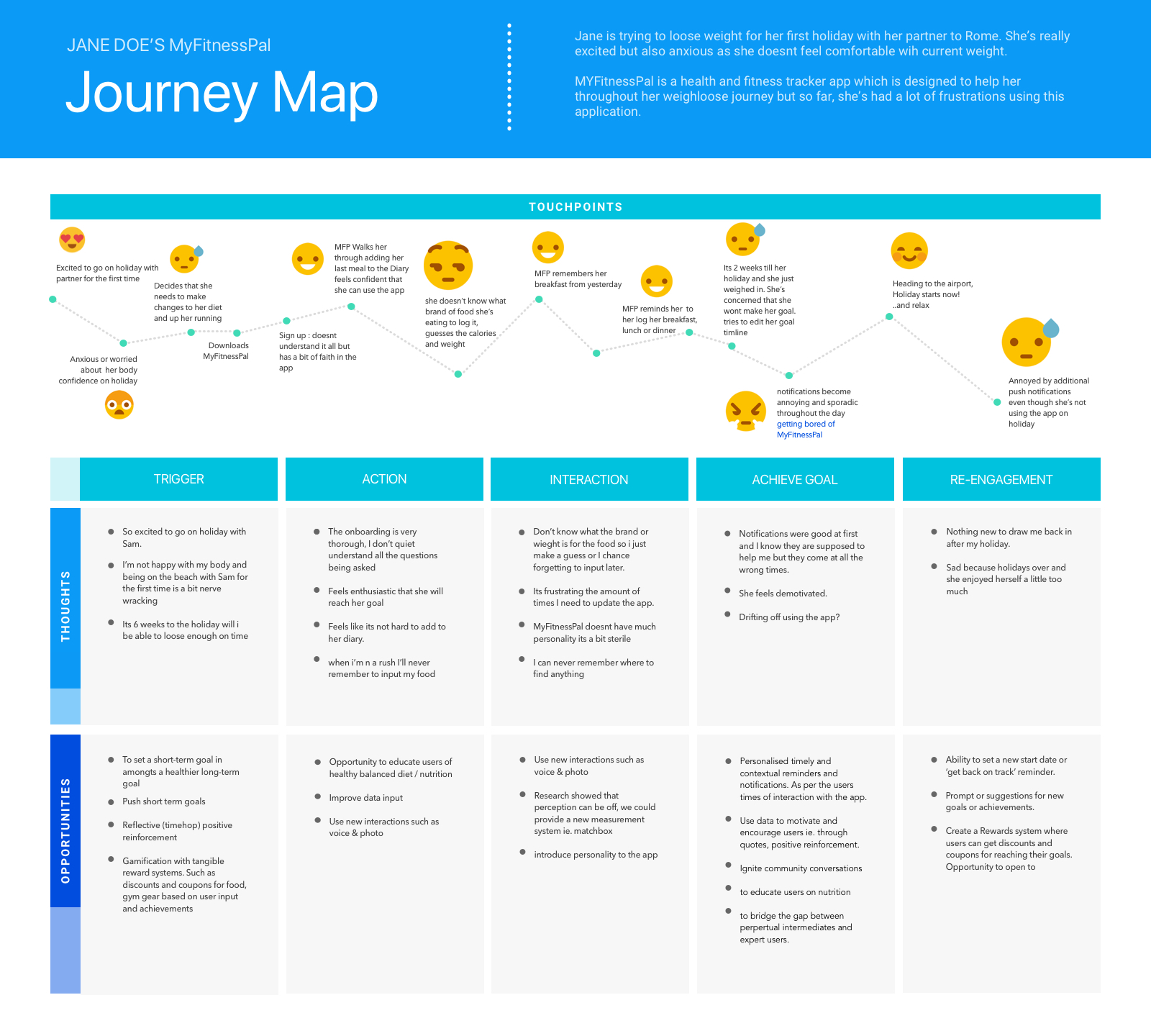
According to Kaplan (2016), the journey map is a way to visualise the journey of the user throughout the process of accomplishing their goals. The journey maps are used to understand the needs of the users and to fix their pain-points. In order visualise the current journey and to locate opportunities and fixes on the user process, a journey map was generated (Fig. 1).

Figure 1. The journey map of MyFitnessPal.

Storyboards

Storyboard is the visual representation of interactions between users and systems in a sequence of drawings. According to Babich (2017), stories are the most powerful delivery method for information because it is easier to be understood, they are more memorable than facts (Bruner, 1986), viewers tend to empathise more with characters who have struggles similar to our own and people are hardwired to respond to stories.

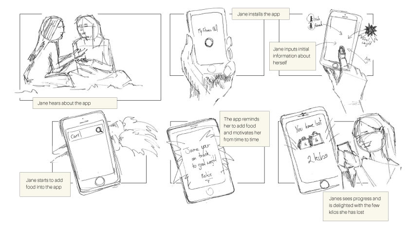
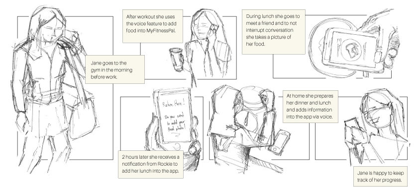
The current user journey (Fig. 1) displayed opportunities that can be incorporated in the future developments of MyFitnessPal. To portray how the team envisage the tasks to be performed by the Persona, two different storyboards were created based on the tasks developed. The first describes Jane during her onboarding process (Fig. 2). The second portrays Jane inputting food into her diary (Fig. 3).

Figure 2. Storyboard of the onboarding process.
Figure 3. Storyboard of the food input process.

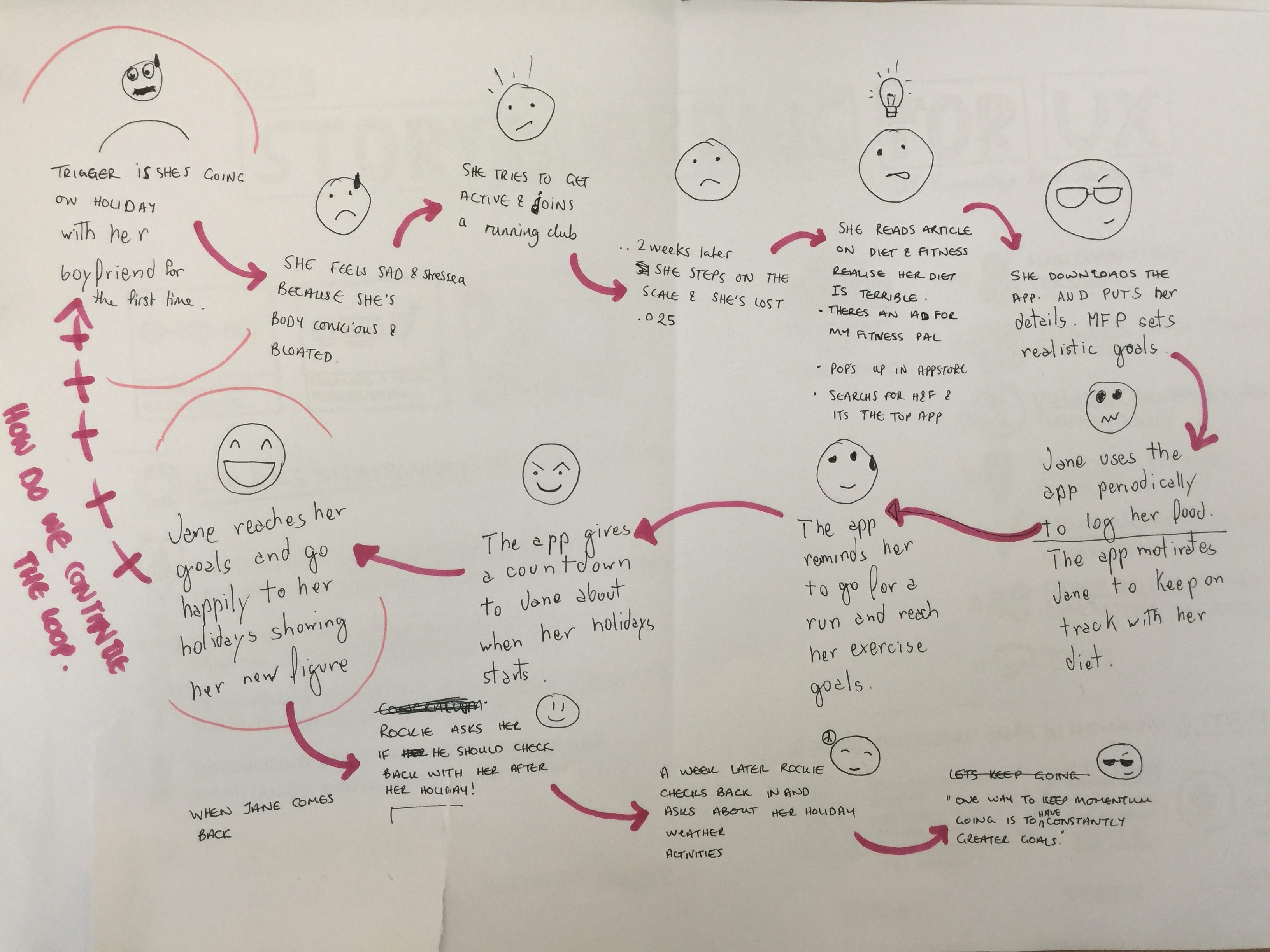
A sketch of the to-be user journey was prepared to demonstrate the team’s vision (Fig. 4).

Figure 4. Sketch of the user journey.

References

Babich, N. (2017, April 30). Storyboarding in UX Design.[https://uxplanet.org/storyboarding-in-ux-design-b9d2e18e5fab]. Accessed 15 April 2018.

Bruner, J. S. (1986). Actual minds, possible worlds. Cambridge, MA: Harvard University Press. 

Cooper, A., Reimann, R., Cronin, D., & Cooper, A. (2007). About face 3: The essentials of interaction design. Hoboken, N.J: John Wiley.
Kaplan, K. (2016, July 31). When and How to Create Customer Journey Maps.  [https://www.nngroup.com/articles/customer-journey-mapping/]. Accessed 15 April 2018.
Competitive Analysis

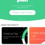
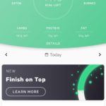
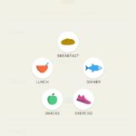
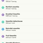
A competitive analysis was made to study different approaches to the tasks that emerged. Two of the most popular apps focused solely on food intake are Lifesum and Lose It! (Fig. 1). Fitbit and Samsung Health (Fig. 1) have a more holistic approach and are one of the most popular health & fitness apps.

Figure 1. MyFitnessPal’s competitor landscape.

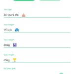
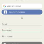
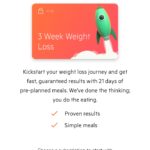
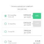
Lifesum – Onboarding, Food Diary & Extra Features

Figure 2. Screenshots of Lifesum’s onboarding process, food diary and extra features.

Lose It! – Onboarding, Food Diary & Extra Features

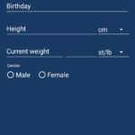
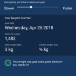
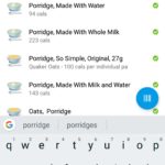
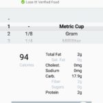
Figure 3. Screenshots of Lose It!’s onboarding process, food diary and extra features.

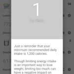
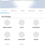
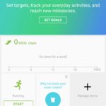
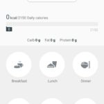
Samsung Health – Onboarding, Food Diary & Extra Features

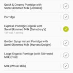
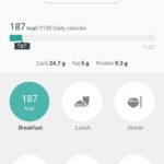
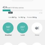
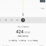
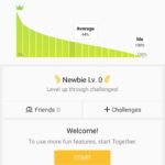
Figure 4. Screenshots of Samsung Health’s onboarding process, food diary and extra features.

Fitbit – Onboarding, Food Diary & Extra Features

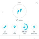
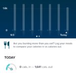
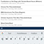
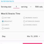
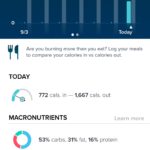
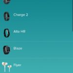
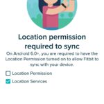
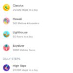
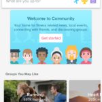
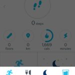
Figure 5. Screenshots of Fitbit’s onboarding process, food diary and extra features.

MyFitnessPal – Onboarding, Food Diary & Extra Features

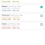
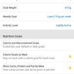
Figure 6. Screenshots of MyFitnessPal’s onboarding process, food diary and extra features.

FeatureMyFitnessPalLifesumLose It!FitbitSamsung Health
MobileYESYESYESYESYES
DesktopYESNOYESYESNO
Premium FeaturesYESYESYESNO**Offers Fitbit CoachNO
Food DiaryYESYESYESYESYES
Social ElementsYESYESYESYESYES
Exercises TrackingYESYESYESYESYES
Sync with Fitness TrackersYESYES**Via external applicationNOYESYES
Notifications / RemindersYESYESYESYES**Cannot be set by userYES
Copy Food from day to anotherNONONONOYES
Add Food for Days in the FutureYESYESYES** For premium usersNONO
BarcodeYESYESYESYESNO
Selfie Progress (Body photo)YESNONONONO
Voice EntryNONONONONO
Motivational QuotesNONONONONO
Educational pieces about the app.NOYESNONOYES
Educational pieces about health & nutritionNOYESNOYESNO
Photo of the food loggedNONOYESNOYES
Nutritonal InformationYES** Partial info for Free UsersYESYESYESYES
Favourite FoodsYESYESYESYESYES
Gamification / BadgesYESYESYESYESYES
RecipesYESYESYESNONO
Goal SettingYESYESYES** Partial info for Free UsersYESYES
ChallengesNOYES** For premium usersYESYESYES

Figure 7. Comparison table of the competitors.