A Heuristic Evaluation was performed to analyse how well MyFitnessPal complies with recognised usability principles. According to Preece (2002), this method is used mainly to find probable usability issues in the user interface by gathering constructive critiques from professionals. In this case, the team members were the evaluators. The heuristic violated were listed and given a severity rating (Fig. 2) on a scale proposed by Nielsen (1995).
| List of heuristics | |
|---|---|
| 1 | Visibility of system status |
| 2 | Match between system and the real world |
| 3 | User control and freedom |
| 4 | Consistency and standards |
| 5 | Error prevention |
| 6 | Recognition rather than recall |
| 7 | Flexibility and efficiency of use |
| 8 | Aesthetic and minimalist design |
| 9 | Help users recognize, diagnose, and recover from errors |
| 10 | Help and documentation |
Figure 1. Table with list heuristics.
| Severity Ratings for Usability Problems | |
|---|---|
| 0 | I don't agree that this is a usability problem at all |
| 1 | Cosmetic problem only: need not be fixed unless extra time is available on project |
| 2 | Minor usability problem: fixing this should be given low priority |
| 3 | Major usability problem: important to fix, so should be given high priority |
| 4 | Usability catastrophe: imperative to fix this before product can be released |
Figure 2. Table with severity ratings.
| Issue | Heuristic Violated | Severity |
|---|---|---|
| Fonts are too small. | 1 | 1 |
| No hierarchy on the font sizes. | 4 | 2 |
| On the user feed, the gap between cards is too small. | 8 | 1 |
| Vital information on the home screen occupies less space than secondary information. | 3 | 2 |
| “Burger” menu on the top left is hard to reach on larger mobile screens. | 3 | 3 |
| Information architecture is confusing. | 2 | 3 |
| Left menu too extensive. Some of the items could be grouped. | 9 | 2 |
| Visual of the app is disconnected from the user’s environment. | 2 | 1 |
| No documentation available to help users on tasks. | 10 | 2 |
| “+” button on home screen is not descriptive. | 6 | 3 |
| Overwhelming amount of data when inputting food into the app (+100 types of avocados). | 5 | 3 |
| Button placements, shapes and colours are not standardized. | 4 | 1 |
| Too many settings and configurations available without a clear hierarchy. | 5 | 2 |
| Hard to find and change some settings. | 1 | 3 |
Figure 3. Table with heuristics violated and severity ratings.
Information Architecture
Information Architecture is the organisation of information inside a visual space (Wurman, 1997). In broad terms, the study of Information Architecture suggests that information need to be accessible and should be easily findable.
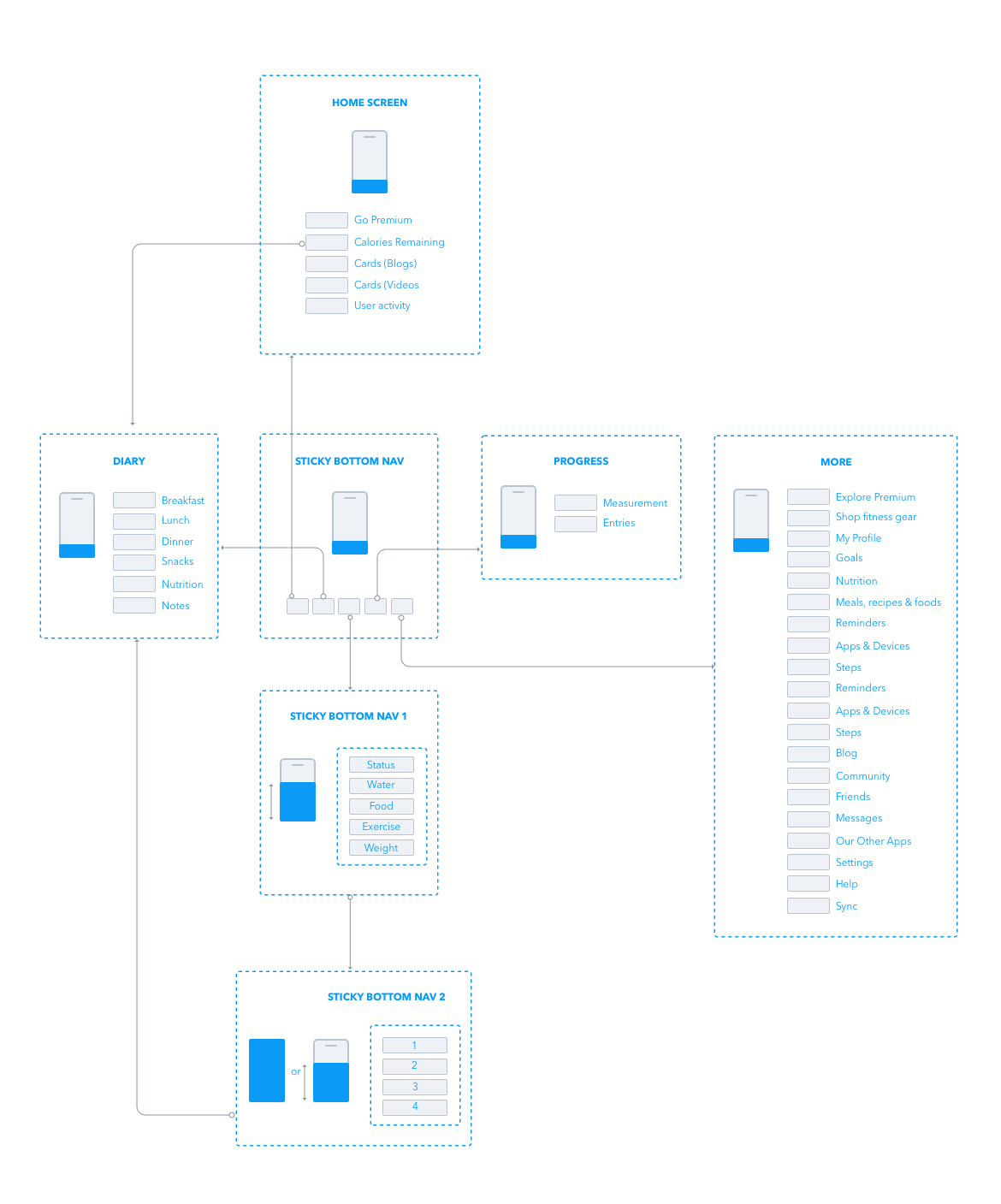
Information Architecture’s primary objective is to influence positively in the user experience, allowing them to search and find the information they need to execute their tasks or to learn something new. Therefore, a mapping of the current MyFitnessPal Information Architecture was created (Fig. 4) to review the current state of the app and to allow a comparison with the proposed solution at a later stage.

References
Nielsen, J. (1995). Severity Ratings for Usability Problems. [https://www.nngroup.com/articles/how-to-rate-the-severity-of-usability-problems/]. Accessed 15 April 2018.
Preece, J. (2002).Interaction design: beyond human-computer interaction. New York: Wiley.
Wurman R. S. (1997). Information Architects. New York, NY: Graphis Inc.
