Contextual Inquiry – Deep diving into information

Contextual Inquiry was the user research method chosen because it gives realistic data as it uses a natural setting to gather behavioural insights around the use of a product, in this case, MyFitnessPal.

A master-apprentice technique will be employed (Beyer and Holtzblatt, 1998). By design, the context inquiry makes it possible to reveal tacit knowledge. Other relevant aspects are that the information that emerges tends to be accurate and it produces highly detailed data. The goal was to observe commonly used features: adding food to their diary, monitoring progress, managing calorie intake and updating goals. The contextual inquiry was conducted in a place where users typically interact with the product. The results will be used to define requirements. 

Six MyFitnessPal’s users, matching the proto-persona defined in the questionnaires, were sourced.

Along with the contextual inquiry, a semi-structured interview (Annex 4) was performed to gather information necessary to triangulate the information from the questionnaires. Before the contextual inquiry, users were informed about the project, what was the goal of that exercise and were asked to sign a consent form (Annex 5). 


Figure 1. One of the contextual inquiries performed with a MyFitnessPal’s user.

The videos, audios and notes from the contextual inquiries can be observed in Annex 6.

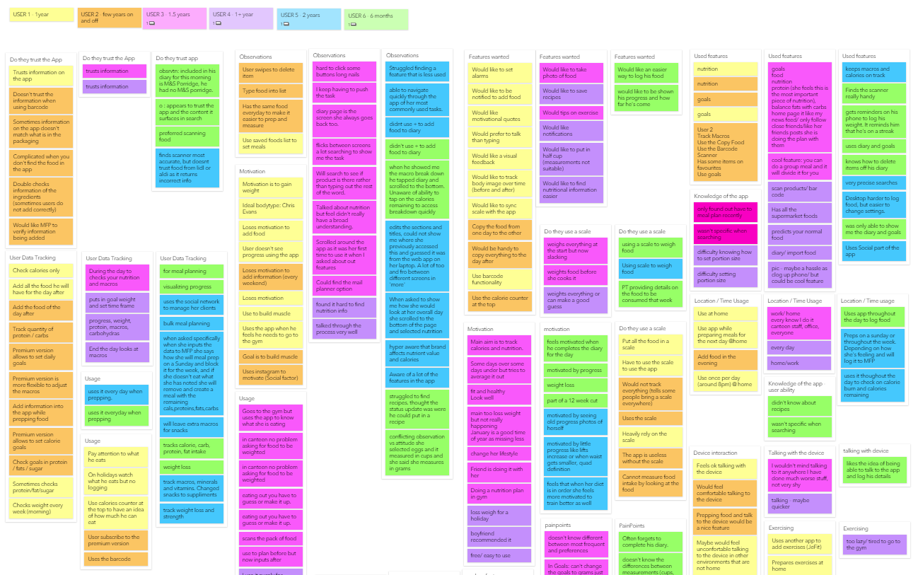
The main points were added in virtual Post-Its on an online tool called Boardthing (Fig. 2)

Figure 2. Overview of Boardthing with data from contextual analysis.

Afterwards, the Post-Its were grouped by themes (Annex 7), and the topics that raised were discussed:

  • Trust issues with data in MyFitnessPal
  • Observations of use
  • Desired Features
  • Used Features
  • Location of use & Time of use
  • The information being tracked
  • Motivations behind usage
  • The use of scale to measure food weight
  • User abilities
  • Useless Features
  • Pain Points

No major issue surfaced during the Contextual Inquiries – users were satisfied with the current solution. Despite the attitude of the users when reviewing the contextual inquiry, all users struggled to locate and demonstrate features in the app. Another point was that users mentioned desired features that they would like to have within MyFitnessPal but these features already existed in the app (Fig. 3). Over a period of time, long time users were demonstrating the same behaviour as novice users.
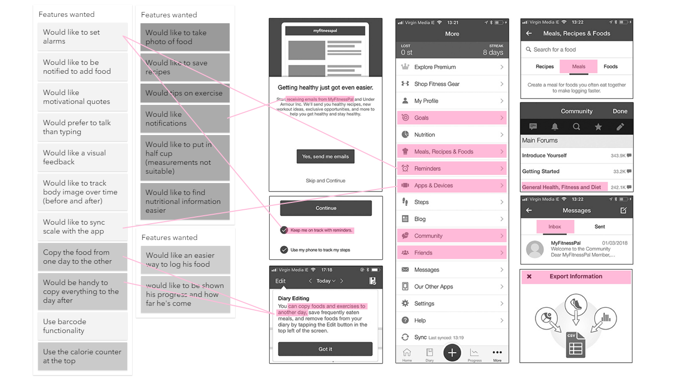
Figure 3. Desired features mentioned by users already available in the app.

Another example is that users responded to the questionnaire that they have more long-term goals than short-term goals but the contextual inquiry revealed that users have more short-term goals – often initiated when a life or social event appear on the horizon.

References

Beyer, H. & Holtzblatt, K. (1998). Contextual Design: Defining Customer-Centered Systems. San Francisco, CA: Morgan Kaufmann Publishers.

Heuristic Evaluation & Information Architecture

A Heuristic Evaluation was performed to analyse how well MyFitnessPal complies with recognised usability principles. According to Preece (2002), this method is used mainly to find probable usability issues in the user interface by gathering constructive critiques from professionals. In this case, the team members were the evaluators. The heuristic violated were listed and given a severity rating (Fig. 2) on a scale proposed by Nielsen (1995).

List of heuristics
1Visibility of system status
2Match between system and the real world
3User control and freedom
4Consistency and standards
5Error prevention
6Recognition rather than recall
7Flexibility and efficiency of use
8Aesthetic and minimalist design
9Help users recognize, diagnose, and recover from errors
10Help and documentation

Figure 1. Table with list heuristics.

Severity Ratings for Usability Problems
0I don't agree that this is a usability problem at all
1Cosmetic problem only: need not be fixed unless extra time is available on project
2Minor usability problem: fixing this should be given low priority
3Major usability problem: important to fix, so should be given high priority
4Usability catastrophe: imperative to fix this before product can be released

Figure 2. Table with severity ratings.

IssueHeuristic ViolatedSeverity
Fonts are too small.11
No hierarchy on the font sizes.42
On the user feed, the gap between cards is too small.81
Vital information on the home screen occupies less space than secondary information.32
“Burger” menu on the top left is hard to reach on larger mobile screens.33
Information architecture is confusing.23
Left menu too extensive. Some of the items could be grouped.92
Visual of the app is disconnected from the user’s environment.21
No documentation available to help users on tasks.102
“+” button on home screen is not descriptive.63
Overwhelming amount of data when inputting food into the app (+100 types of avocados).53
Button placements, shapes and colours are not standardized.41
Too many settings and configurations available without a clear hierarchy.52
Hard to find and change some settings.13

Figure 3. Table with heuristics violated and severity ratings.

Information Architecture

Information Architecture is the organisation of information inside a visual space (Wurman, 1997). In broad terms, the study of Information Architecture suggests that information need to be accessible and should be easily findable.

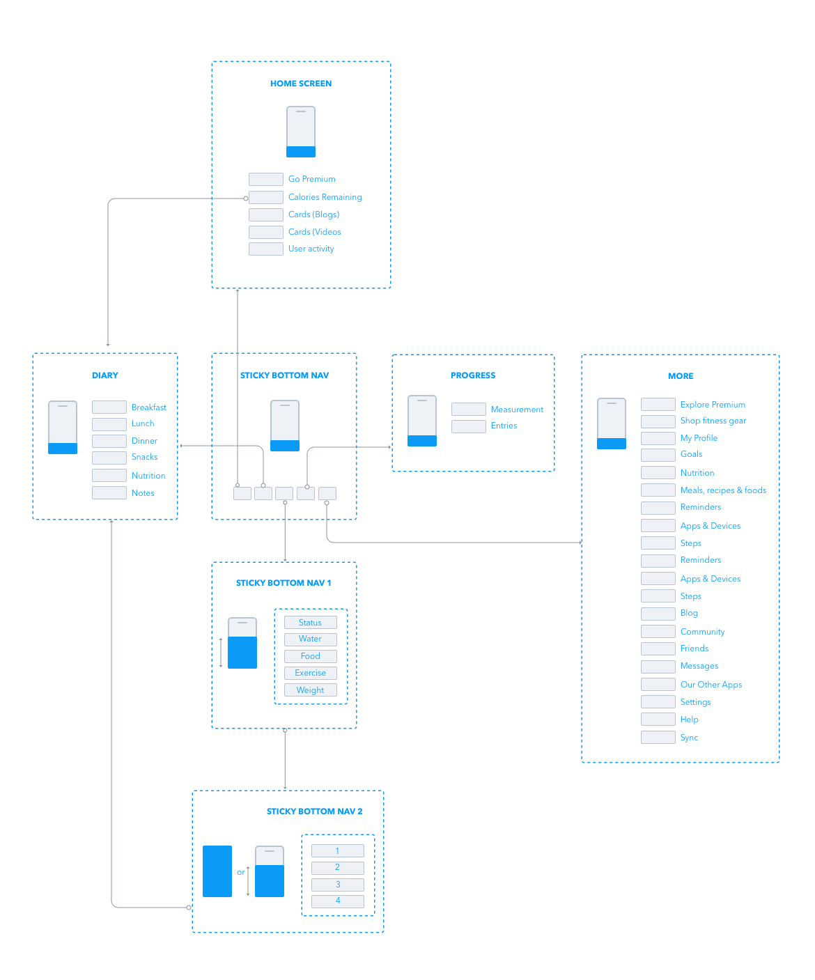
Information Architecture’s primary objective is to influence positively in the user experience, allowing them to search and find the information they need to execute their tasks or to learn something new. Therefore, a mapping of the current MyFitnessPal Information Architecture was created (Fig. 4) to review the current state of the app and to allow a comparison with the proposed solution at a later stage.

Figure 4. Information Architecture of the current MyFitnessPal application.

References

Nielsen, J. (1995). Severity Ratings for Usability Problems. [https://www.nngroup.com/articles/how-to-rate-the-severity-of-usability-problems/]. Accessed 15 April 2018.

Preece, J. (2002).Interaction design: beyond human-computer interaction. New York: Wiley.

Wurman R. S. (1997). Information Architects. New York, NY: Graphis Inc.


Problem Statement

According to Brown (2016), teams that have a well-built problem statement can align efforts towards solving a problem, define the goal of the solution being designed and make the team care about solving that problem and consequently achieve the goal (Fig. 1). For a problem statement to work, it needs to be recognised by the whole team as a focus point and align everybody involved towards the same direction.

Figure 1. The three pillars of a well-defined problem statement (Brown, 2016).

As discussed previously, MyFitnessPal’s users demonstrated that over time their knowledge of the app was not improving over time. Features were lost in a complicated Information Architecture. To solve the issues detected, our problem statement became:

“Users concerned about health and nutrition need to input data about their food intake but face a complicated interface that discourages learnability.”

References

Brown, D. (2016, November 11). How to Build a Problem Statement. [https://medium.com/eightshapes-llc/how-to-build-a-problem-statement-d1f21713720b]. Accessed 25 February 2018.