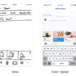
Based on the user feedback from the second iteration (Annex 13) some elements were changed (Fig. 1).
- Camera icon added to the first screen to eliminate an extra click.
- Text input – Added example interactions (Conversation Suggestion Pillows) on top of the bottom row to educate users of the possibilities of interactions with Rockie. This is based on the Google Assistant chatbot (Fig. 2).
- Text input – Modified mental model as users expect to add ingredient by ingredient instead of adding a list of items in one single line.
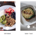
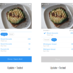
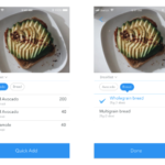
- Photo input – After taking a picture of the food, the user can press “Quick Add”, if the user did not choose this option on the first screen user was locked within the ingredients selection list. That was changed to allow users to skip.
- Photo input – Items on the food selection process became clickable.
- Photo input – Removed the swipe to the right to add to a list on top. This interaction is found in other apps but the usability becomes poor if the list of items is too long making the items to be selected disappear from the first fold of the screen.
- Voice input – Removed the hold to send button.
- Voice input – Added visual feedback when chatbot is expecting the user to talk.
- Voice input – Conversation Suggestion Pillows was added to allow the user to choose between a full voice interaction or choose a common option.
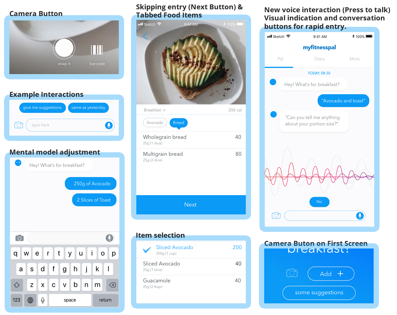
Figure 1. Modified elements based on user feedback. 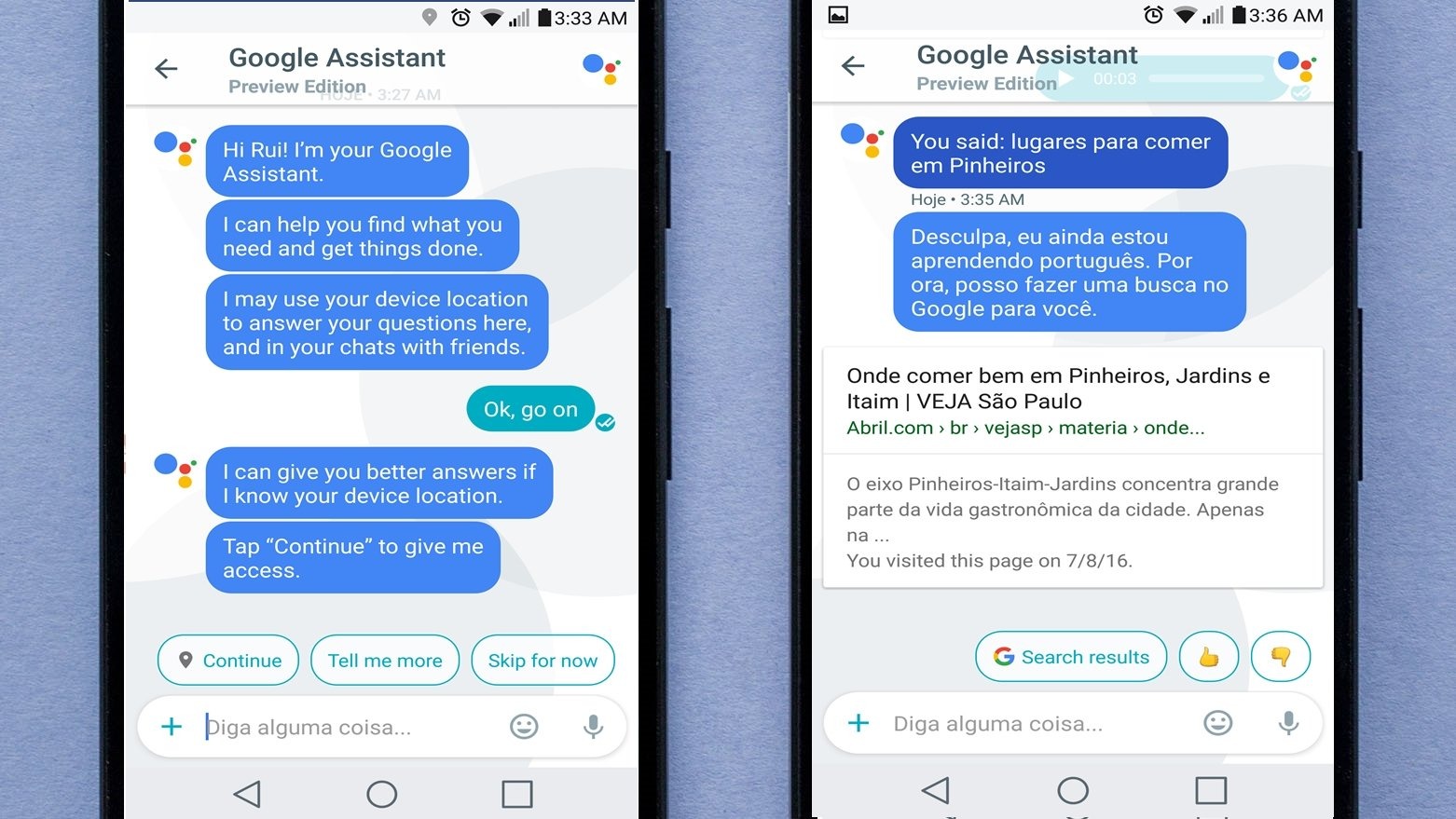
Figure 2. Conversation Suggestion Pillows used on Google Assistant.
After these modifications, a guerrilla testing was made to validate some of the proposed solutions, and a video of the final prototype was produced (Fig. 3).
Figure 3. Video of the full prototype.
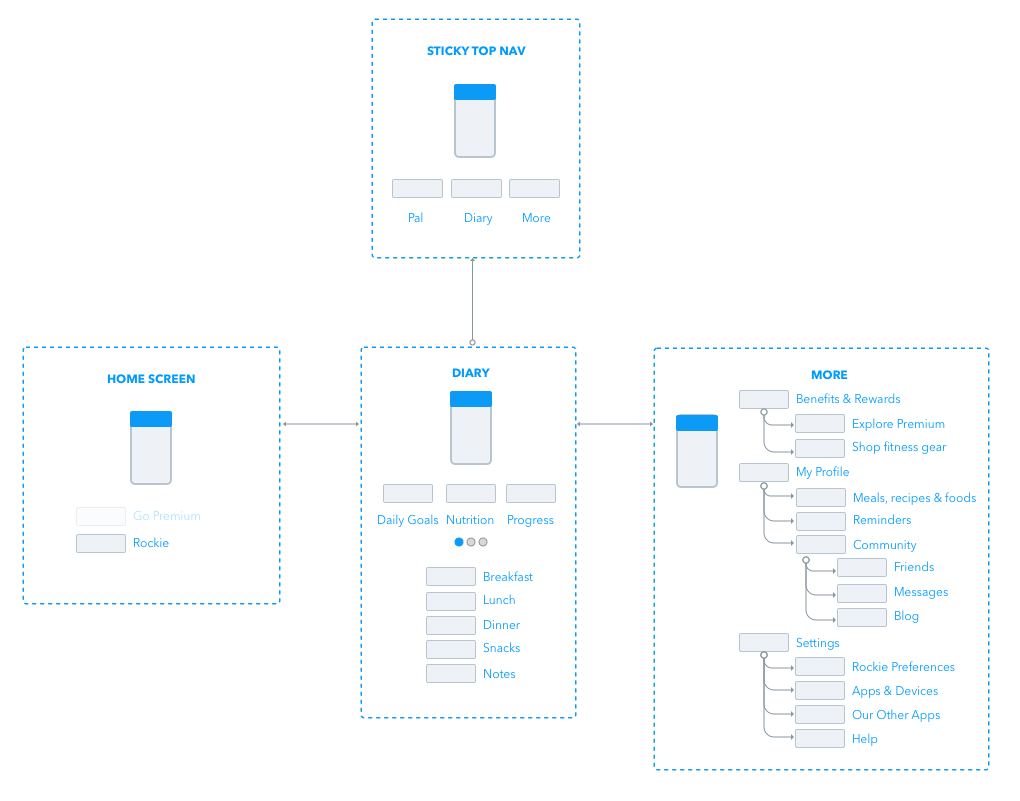
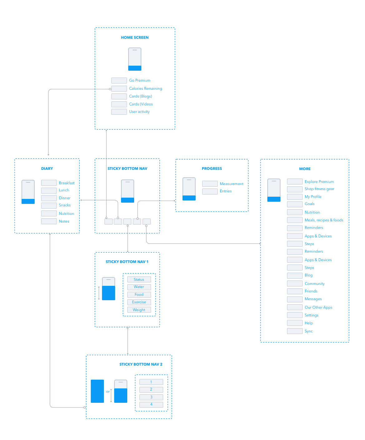
The architectural information was reviewed (Fig. 3) and compared with original structure (Fig. 4).
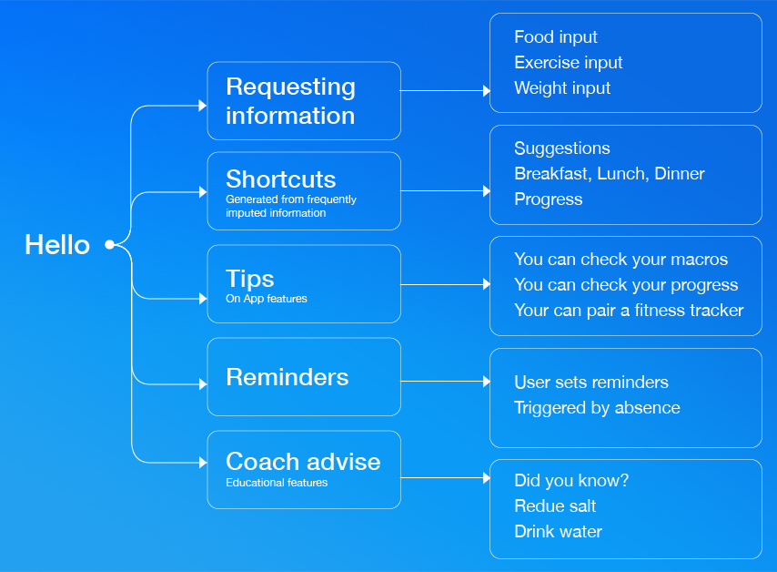
Despite the usability issues encountered during tests, most of the errors occurred because the prototypes supported one single mental model. At this stage, the team started to reflect on different mental models, input entries and different interactions. A mapping of the possible interactions with Rockie was built (Fig. 5).
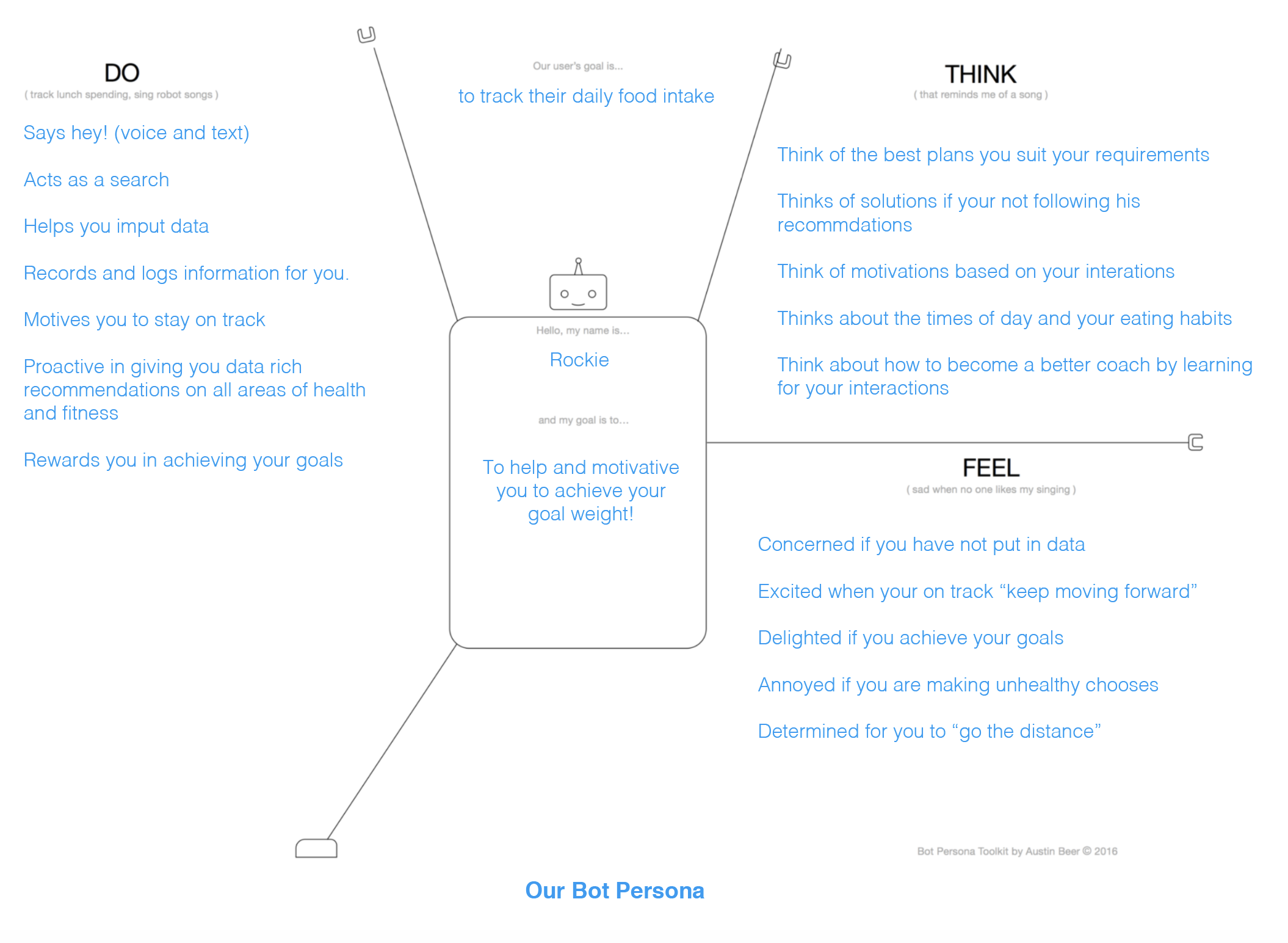
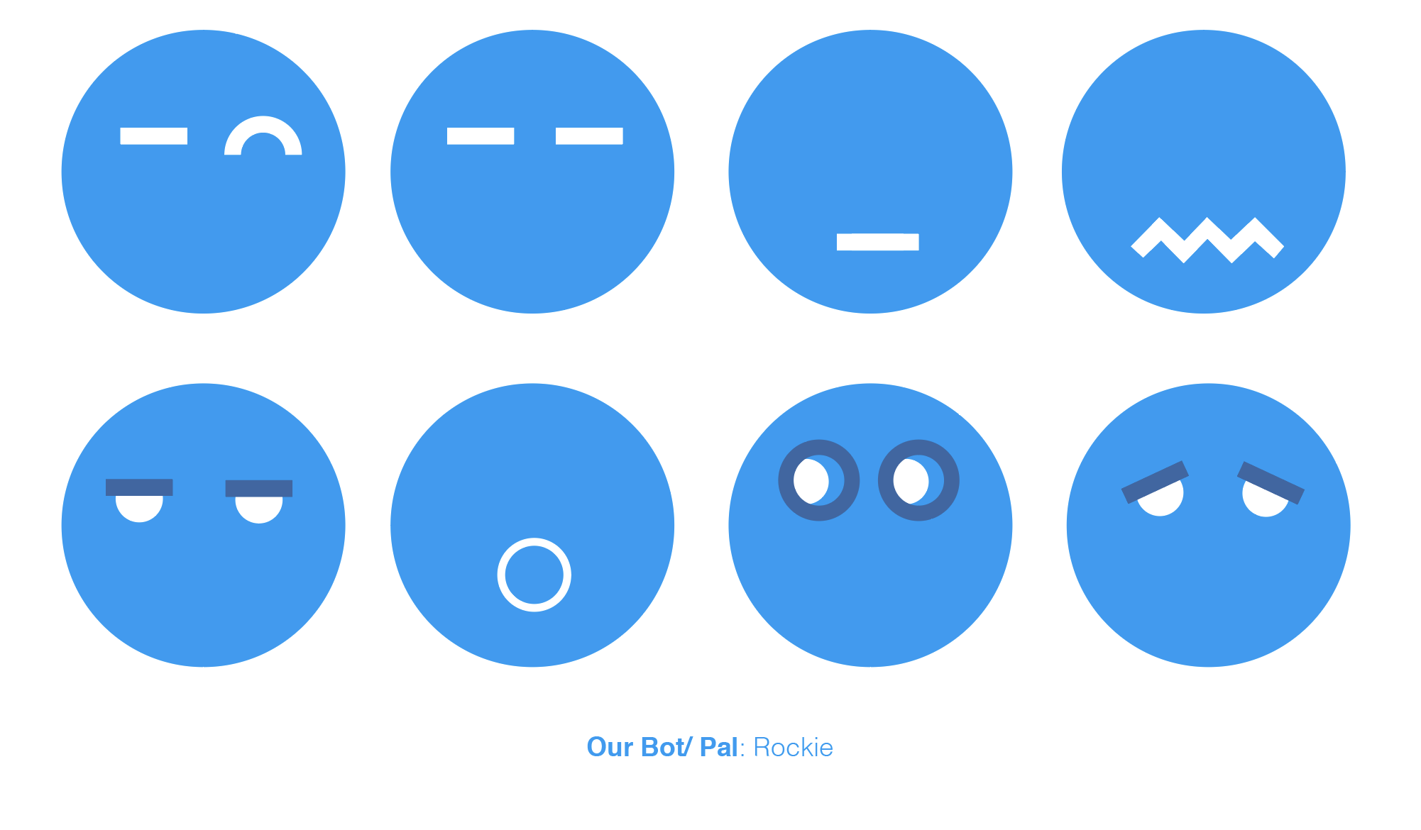
Finally, while Rockie fits Jane, it might not be suitable for all users. The team started to examine further bot interactions, different characters, bot personas (Fig. 6) and visual feedback (Fig 7).
Evolution of elements
An evolution of the elements throughout this process was mapped (Fig. 8).
Figure 8. The evolution of UI elements throughout the process.
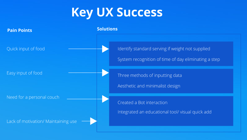
UX Success
Looking back at the goals and the problem statement proposed initially, the pain points were solved during this project (Fig. 9). Inputting food became an easier process, the various input methods fit the user’s lifestyle, navigating and exploring information became easier and more accessible. A diary study would be necessary for further developments to verify if the proposed solutions enticed users to continue using the app for longer periods.
